12 January2014
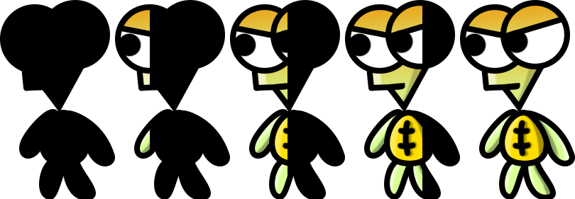
I honestly feel that this game is really starting to take shape in terms of graphics! (Then again, I am always constantly improving the graphics despite thinking it would be final.)
I’ve added a ton of stuff lately and I’ll go through each briefly in detail one by one!
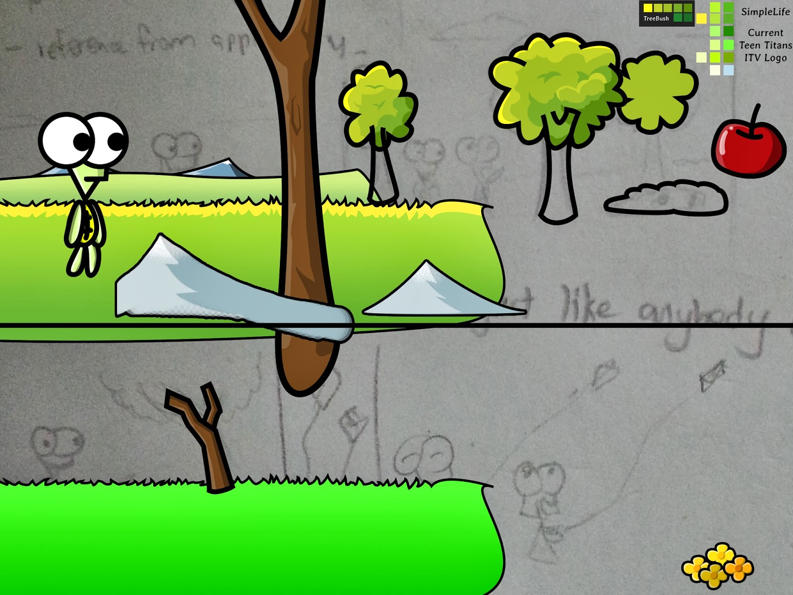
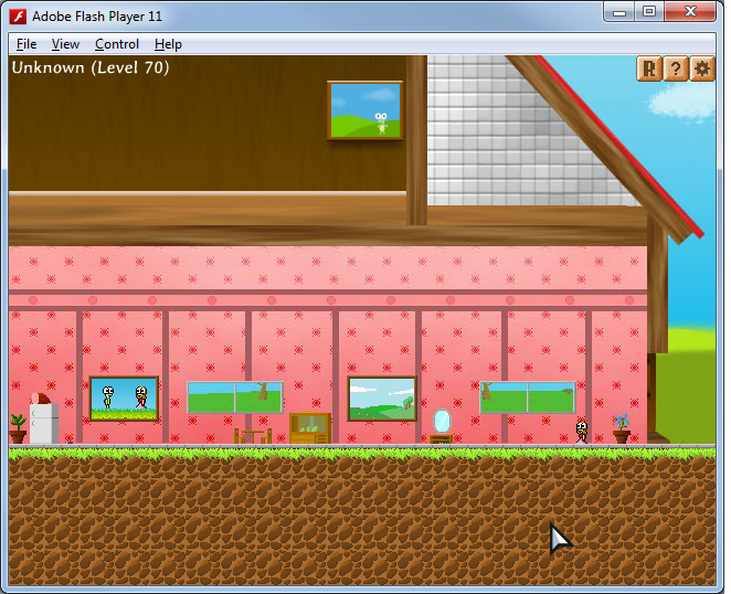
New Tiles
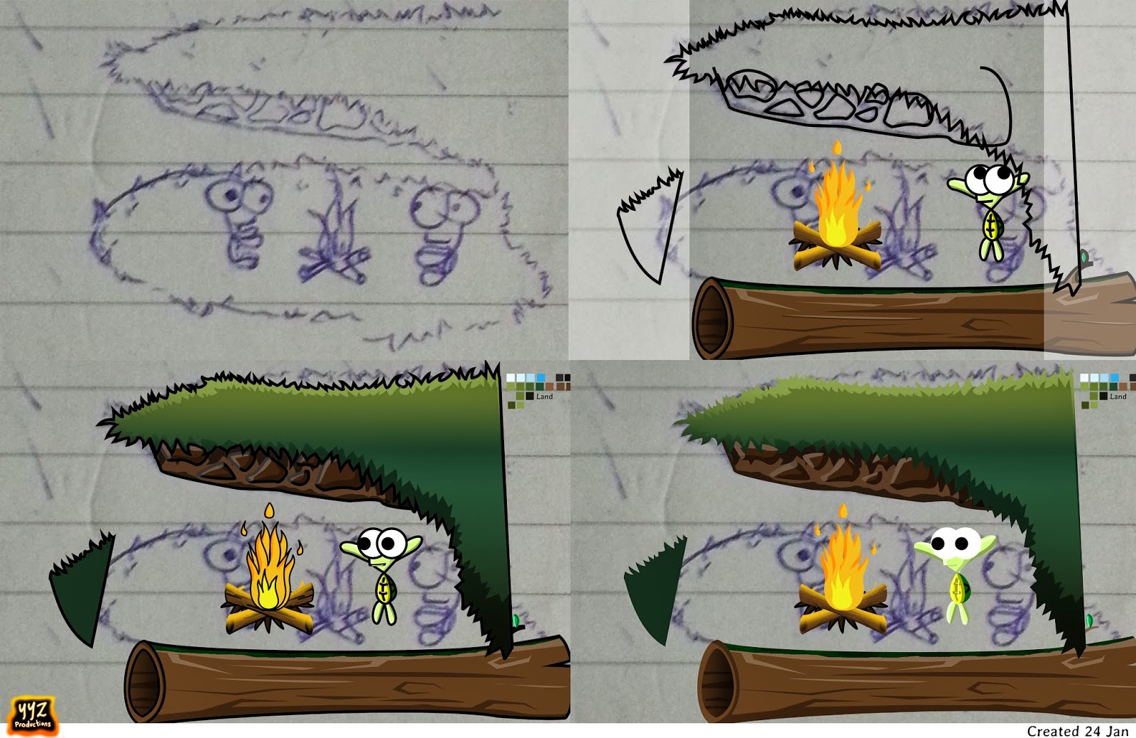
I had a couple of tiles drawn and put into the game to test which were better. I also did color variation of the tiles to see which color scheme would fit the level the most. I did this after sending my game to Li Hao, who said that some tiles looked great because of the colour, but they lacked the detail and stuff that the other tiles did. So I later went to modify the detailed tiles’ colour in hope of achieving the same matching colour scheme that the old tiles did.
It is sort of funny because I seem to have gone one big round, and suddenly after drawing so many new tiles, the old tile ends up being the one with the most matching colours! But I think if I can get my new tiles to match the colour scheme, it would look greater ultimately.
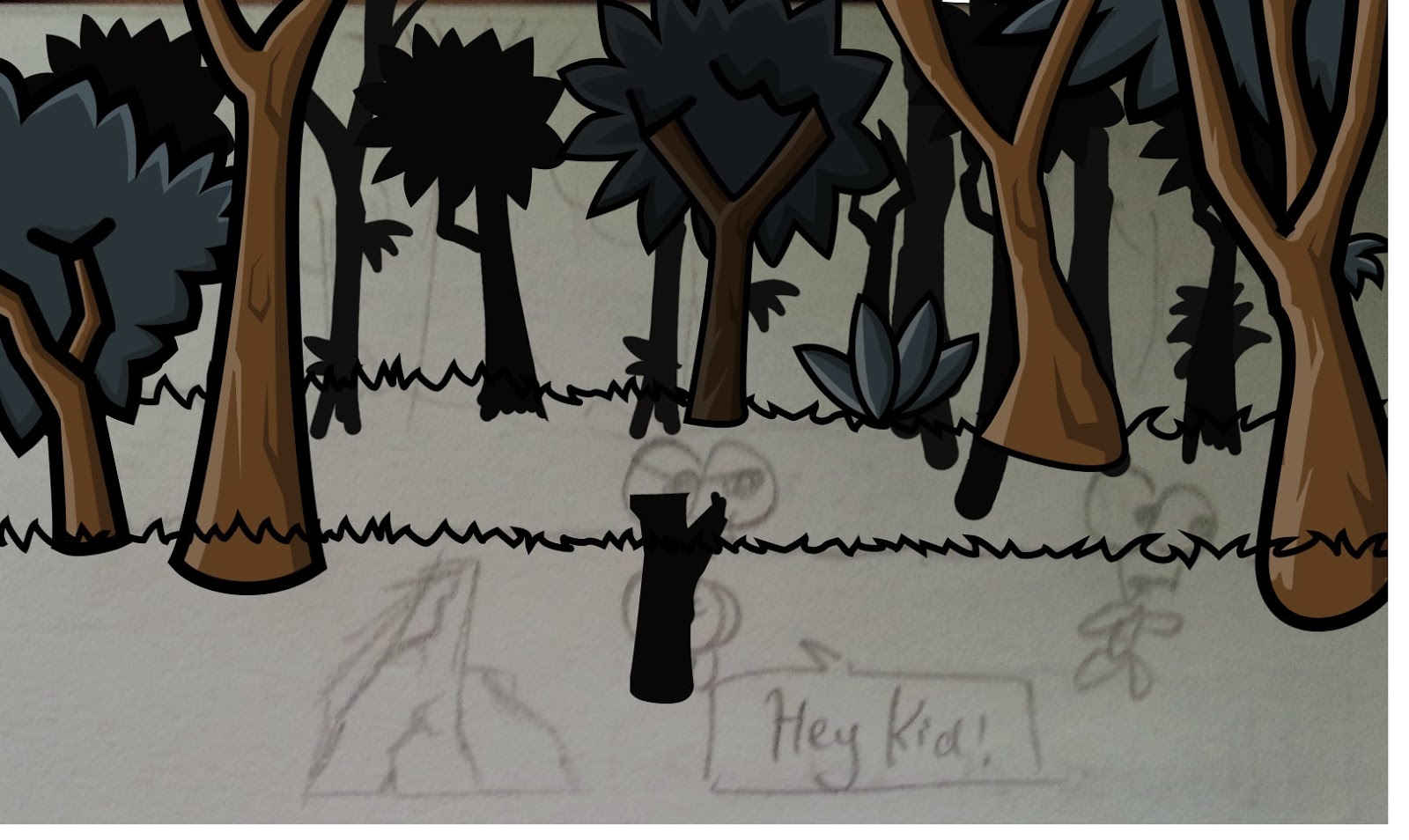
Anyway, these were the tiles that were made before reaching the final result. A lot of these were drawn a long time ago and looked really bad and were crap, so they were discarded.
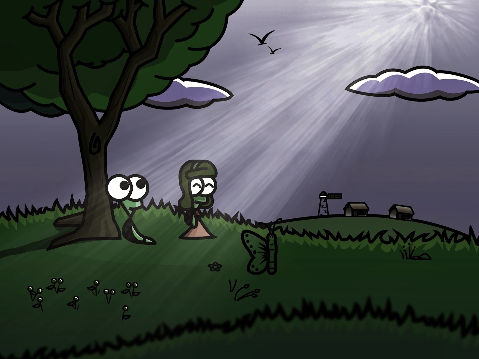
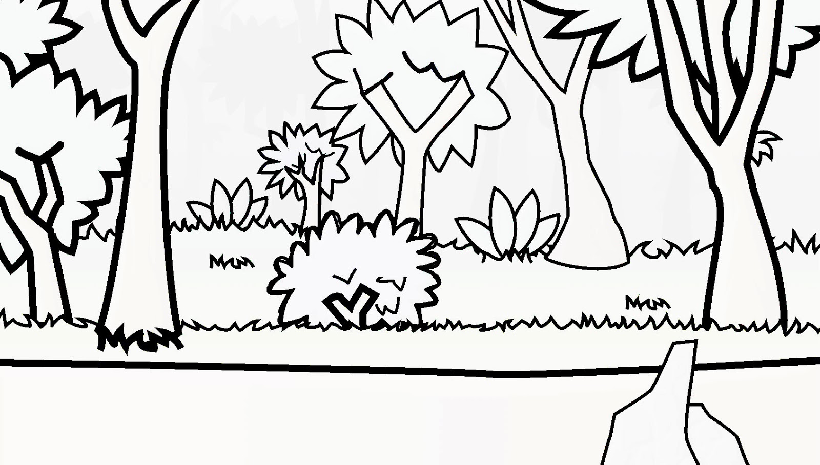
Currently in use for Countryside:
Used to be the tile for Countryside:
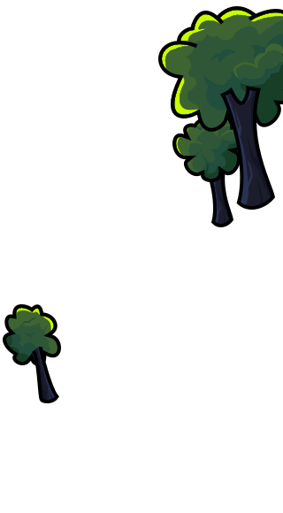
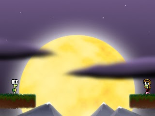
Currently in use for Hills:
Might implement for Hills:
Might implement for Hills:
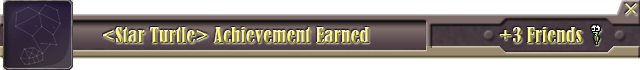
New Achievements Popup
The problem with the old achievements popup was that it took up a lot of space. Even though I added the option to close it, it doesn’t solve the original problem of it being big. It also looked far too futuristic and the style was quite off. So I went to look up how acheivement popups look like in other games, and decided to scrap my old popup and make one based on the references I found.
I did a new popup, and well, I think it still looks a bit too futuristic. I think I tend to like to draw futuristic stuff and hence it kind of affected the way I draw popups, but at least it looks much nicer. It is sleek and smaller! I like the close button at the top right. It turned out better than expected.
Old Popup:
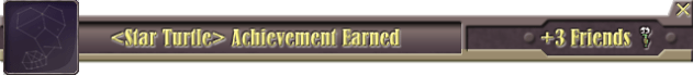
New Popup:
I’m still testing how it works so the popup might not be finalized. In fact, nothing here may be finalized, including the tiles. The good thing about the new popup on the programming side is that I now use this template:
And then I just code which “icon” and what the achievement “name” is. I don’t have to make a new picture to add a new achievement. I just use the template, change the icon and name and tada!
It makes me want to add more achievements because it’s so easy to add achievements now. The Achievement class settles everything. I just need to add two lines of code!
memoriesAchievement = new Achievement(“Digging through Memories”); //Create the achievement
memoriesAchievement.earn(); //Reward the achievement to player
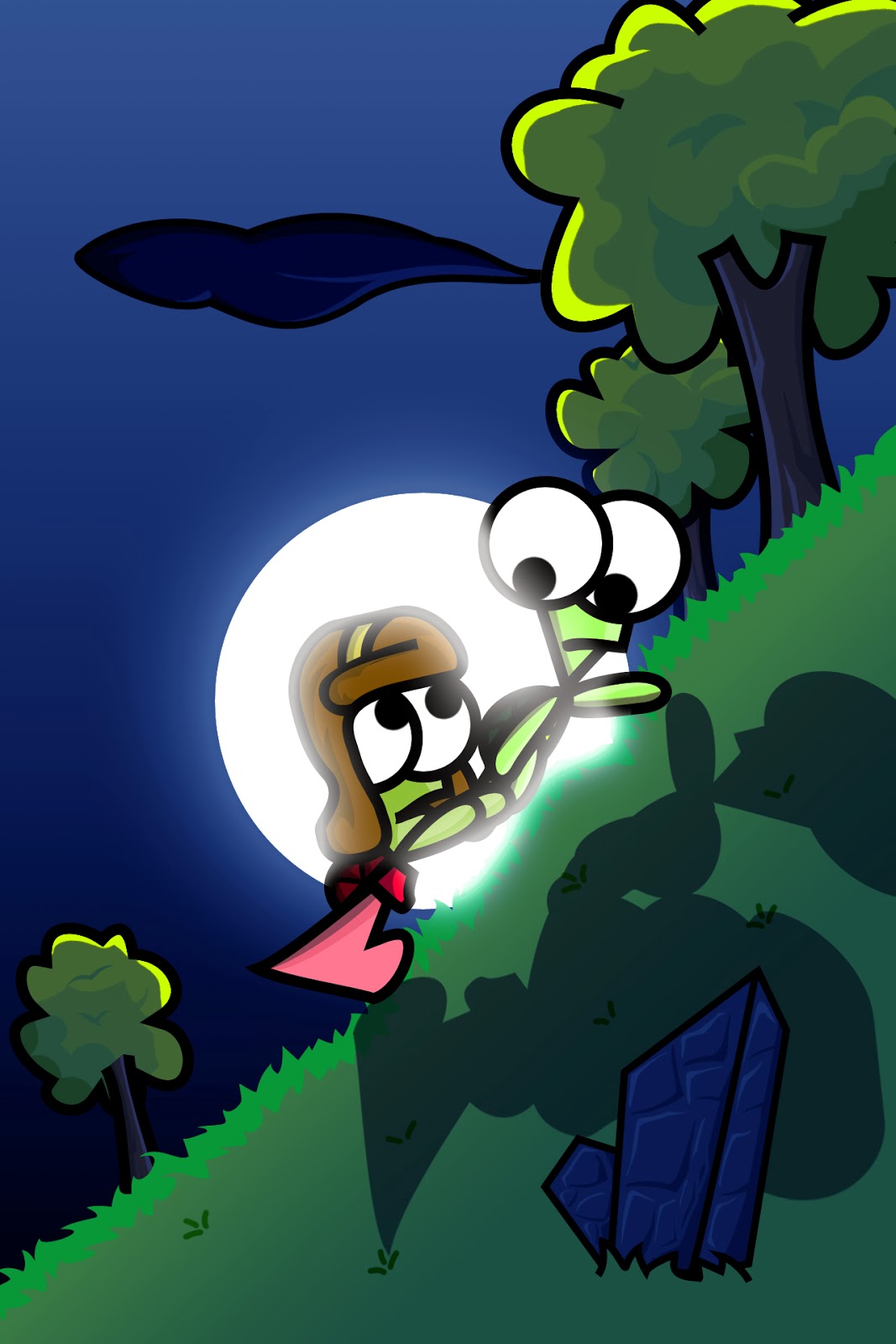
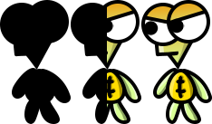
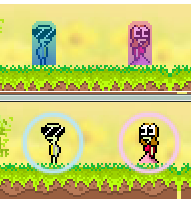
Hats and Shell Accessories
My favourite new feature.
I added Hats in the game! The player can now wear hats. There are currently 4 different types of hats, 2 of which are actually sunglasses that cover the eyes instead of the head.
I also added the ability to change shell colour. There are currently 9 shell colours to choose from. There are more variations, but I took a few screenshots just for show:
Currently, these features are more for fun. You can change your hat by tapping “H” on the keyboard, and change your turtle’s shell colour by tapping “J”. Your preferences are saved, so every time you load the game, you don’t have to re-switch to your preferred hat/shell colour.
I have not added a user interface for this yet since this feature is pretty new and honestly, very pointless. It’s not even something I intended the game to have, but it was quite fun to do it. It’s my game afterall, I have the power and can do anything! HEHE. Just kidding of course.
Oh, did I mention that certain hats actually “float” down when you fall from a high height? I wanted the hat to really show as a separated object instead of just something that is “fixed” onto the turtle’s head so I gave it a bit of physics. This was actually more complex than I thought since it didn’t look real at first, but I managed to figure out how to make it look more realistic in the end. I think this effect is pretty cool.
I also made the Hat scale accordingly with the player’s height and width when he collects friends. The scale works awkwardly with animations though. There are also some bugs with the hat and the girl gains some magical properties when she jumps on top of the guy when he wears a hat (Magic hat much?), so I’m not done with this feature yet. Might not even implement it in my final game since it is just not a meaningful addition to the game.
Abilities / Effects
The ability to be invulnerable to spikes and enemies were implemented long time ago. But I never made any effects on the character to show that they were in effect, but now they do:
This being a new feature, I might change it over time as the top shield doesn’t look as nice as the bottom one. You can stack both the top shield and bottom shield.
Unimportant: Trivia:
I got the ring shield as an idea when I had a bug and created a ring around my character. The ring was supposed to expand outward and fade out, but it remained stuck to the character and followed him. That was when I had this idea! It’s bugs like these that inspire me.
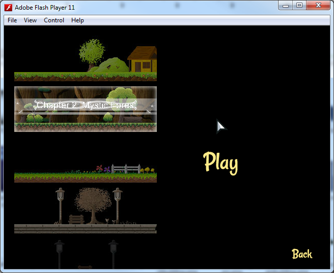
Comic Selection UI
I added the new Comic button to the Main Menu. I also reduced the gap between each button so I don’t have to stretch them out so much and clutter the Menu.
When you click on “Comic”, it directs you to this screen:
I intended the book to look like the screenshot below at first, with every picture having “Chapter X: yyy” on it. But guess what I did in the end?
This:
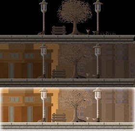
By default, the button looks dark when you do not roll over it. (Top picture)
When you roll over it, the background appears. (Middle picture)
When you click it, it is selected and brightens up. (Bottom picture)
Also, when you select the picture, the words “Chapter 2: xxx” appears with a trailing animation behind it. I think it looks rather neat rather than have all the pictures display the words like above.
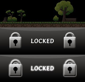
But if it’s locked, a new button is used. Rolling over will tell you so.
Attempting to click the button even though it’s locked, will cause the “LOCKED” to glow.
I like Chapter 4’s button. I think it looks the most fabulous:
I made this comic selection screen because I previously put an ugly button at the menu for me to temporarily access and test the comics, and the ugly white button really irritated me to the core, so I decided to actually attempt this and see how it went.
With that, I conclude this post of one of the most productive weekends I ever had, after sleeping at 7am yesterday.
EDIT:
Updated ‘My thoughts so far’ on 13 Jan. The following has nothing to do with the game itself, so uninterested readers need not continue.
My thoughts so far
Well, this is the first time in a long time that I did such a dedicated post. I put up so many pictures, took so many screenshots…it’s just wonderful. Just reading the posts before this one was quite disappointing. I felt a bit bored reading my own posts since I had begun to lose interest in the game while away from it. But this post actually felt different. I hardly had this level of motivation working on Introvert ever since I was enlisted into National Service. I hope this motivation will continue on for as long as possible!
Since I kept this game quite low-profile, only four people have actually played my game before, in order:
– Myself
– Li Hao
– Han
– David
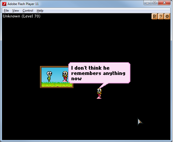
Soon, I will have a fifth person try my game, and I can’t wait to recieve feedback, because for once I’m actually letting somebody who has NEVER seen my game before, play my game. I realised one thing about myself is that I have the tendency to prefer new stuff. When I see the game and test it every day, I get accustomed of it to the point that whenever I draw new tiles or new backgrounds, or create new level layouts, I instantly feel the new one works & looks better. That is until I realise that sometimes, it is because from my perception, this ‘new’ thing looks better because it replaces something old which I keep seeing for a long time.
In a way, the longer I test the game, the greater the inaccuracy of my judgement. When there is something ugly in the game, and I see it for 100 times, suddenly I get used to it and so comfortable about it that I forget that it is something I need to change. Take the achievements popup above for example. I actually forgot about it, until somehow I remembered it yesterday through a conversation with Li Hao.
Since this game has been with me for a long time, I’m frankly quite excited to have a new person testing the game and hopefully, since I get a fresh opinion on things and hopefully I will get constructive feedback. Haha!

 This made me rethink about the way I draw my comics digitally. Li Hao talked about WACOM, a drawing tablet that can potentially solve my problems. It’s an expensive investment though. But it will make my life smoother.
 Sadly, at this point, I am beginning to realise that perhaps game development isn’t something I might pursue, since I am doing better at other areas, from what I have been told. While this project has come a long way and I am more proud of it than anything else I have ever done, I feel it lacks a lot of the feeling that I express through drawing.